
|
2/17/2016 4 Comments Leaving it on the TableWhen should you use tables to supplement your writing and when is it unnecessary? Creation of tables in Word or Excel has a learning curve, so if you struggle with it at first as a writer or editor, you’re not alone. The first thing everyone should know is the terminology applying to this topic. If you get that down, you’ll be better able to look up help for problems if they occur, not to mention being able to communicate with your editor, advisor, and others in the process, as well as not signaling to the reader that you’re uninformed. Table: A table is a grid-style presentation of alphanumeric data (that is, letters, words, and numbers) in rows and columns.* If you use APA style, be aware that it includes very specific formatting rules for tables and their captions. Chart or graph: Both of these words refer to a data display that presents the relationships among pieces of information in a visually helpful way. Bar charts, pie charts, flow charts, and line graphs are common types. Figure: The figure category can include charts or graphs (but not tables), as well as any other kind of visual material that enhances the text, such as illustrations or photographs. APA style, again, has particular rules for captioning figures. And that’s enough said about figures; this post will focus on tables. When to Use TablesSome fields use tables far more than others. If your research uses quantitative data, you’ll probably use tables frequently, and you are likely to have plenty of examples to draw from in the journals most central to your discipline. There are fields of research, however, in which table use is only occasional, and it might be less evident when they’ll be useful and when they’ll be arbitrary. Quantitative uses for tablesQuantitative uses for tables
Qualitative uses for tables
ExamplesQuantitative/useful The following table isn’t huge, but it contains a good deal of numeric data. 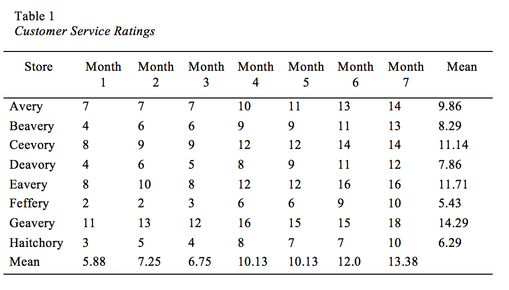 You can see at a glance that although there’s plenty of variation in the customer service ratings within each store, the mean ratings clearly go up as the study progresses. What this means to the research, however, is a mystery to someone merely looking at the table. A discussion and analysis needs to appear in the text. Quantitative/not useful I edited a master’s thesis a few years ago that contained a lot of tables like this one: 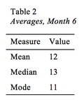 If I had been more experienced at the time, I probably would have suggested to the author that he should fold the info into the text instead of creating tables for such a small and straightforward amount of data and to rethink whether it was important at all. The purposes for viewing the mean, median, and mode in this way are very limited unless you’re writing a math textbook. In fact, the only measure the author even discussed in the text was the mean. As a basic guideline, if you’re not going to be discussing it and it doesn’t contribute to an understanding of something you do discuss, then it probably doesn’t require an entire table. Qualitative/useful This sample table presents qualitative information about a study’s participants in a clear and readable format. 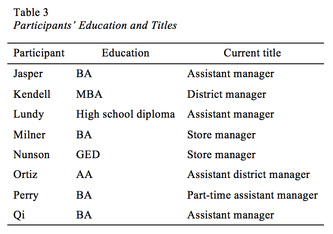 The author would be able to draw from or point to this table in conjunction with their discussion of participants’ interview comments to allow the reader to keep track of who they’re referring to at any given time. The names used would in most cases be pseudonyms. Qualitative/not useful The thesis I mentioned above also had a lot of tables like Table 4, but again, I was too inexperienced at the time to feel comfortable questioning them. (Theses and dissertations also involve advisor guidance and feedback, so I figured that the author’s advisor would be the primary arbiter on whether tables like these stayed in; he could even have been the one who requested them in the first place.) 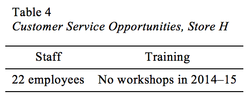 What the author wanted to achieve with this table, I can only speculate, but there are two treatments likely to be more effective than this one: (a) folding the information into the narrative of a paragraph or (b) creating a table that includes the equivalent information for all the sites of observation to facilitate comparison. That is, include all eight stores, staff sizes, and trainings in one table. Too Much of a Grid ThingThe two not useful examples above depict ridiculously small amounts of information. In each case, the information conveyed—if it needs to be highlighted at all—would be more readily processed by the reader if it were in a narrative form.
But tables can be too big to be useful, as well, or at least too big for a reader to want to give them a second glance. When that is the case, the data might be helpful, but the table does not need to be prominantly placed in the middle of your text. As I noted briefly above, this is a good use for an appendix, so shove those tables to the back of the manuscript and use the body text to discuss the highlights, the findings, and the analysis.** Refer to the tables as much as you need to from there. This is a no-brainer with respect to large tables of quantitative data, but I’ve encountered gigantic tables of qualitative—even narrative—information that was placed within a chapter’s text. In such an instance, do whatever is standard for your field of study, but if your field could go either way on the placement of such tables, I think they are more elegant and the overall work more readable if they’re in the appendix. Most readers are not going to appreciate having to read through a rows-and-columns display (or page through the section until they get past it) and would rather refer to material in this format as a reference. Stemming from that last idea as a final thought, whatever material you do put into tables and wherever in the document you place them, treat them in the text as points of reference. Tables and figures in an academic work should never be left to speak for themselves. Don’t, for instance, write a conclusion based on data that was presented in a table but not discussed earlier in the text. And don’t say simply, “The results can be viewed in Table 20,” without saying a bit about what you want the reader to be noticing there. In sum, continuously look at your tables and text from a reader’s point of view and with the difference between seeing and understanding in mind. Well-constructed and well-positioned tables can be excellent ways to aid your readers in appreciating your research. * Sometimes, though not usually, a table can include pictures. I have edited not one but two separate books that included tables displaying data on fecal matter with respect to a stool’s appearance. Yes, I edited around pictures of poo. Just another day’s work. ** Some academic journals want all the tables and figures to be in the article’s appendix, as well, but that’s something you’d want to check their style guidelines for.
4 Comments
6/23/2021 10:45:52 pm
I am learning Microsoft excel through online videos. But this bog has helped me a lot and I got to learn about the drawing of the tables in Microsoft excel through it. Always looking forward to have some Microsoft office related content through this blog. 1/18/2024 10:47:38 am
Kalanchoes are known for their vibrant, long-lasting blooms that add a burst of color to any setting. These succulents are often cultivated as houseplants and are valued for their low maintenance and ability to thrive in indoor conditions. 2/9/2024 08:09:27 am
The loan is conditionally approved, the borrower must fulfill any outstanding conditions or provide additional documentation as requested by the underwriter. Once all conditions are met, the loan can proceed to final approval and closing. 3/11/2024 11:43:41 am
Investing in a roof can enhance the overall livability of your home by creating a more comfortable indoor environment year-round. By reducing heat transfer and maintaining consistent temperatures. Leave a Reply. |
Archives
March 2017
CategoriesAuthorI'm Lea, a freelance editor who specializes in academic and nonfiction materials. More info about my services is available throughout this site. |
 RSS Feed
